

💰3 Tips to Avoid Headaches in Webflow · The Bunker #75
💰3 Tips to Avoid Headaches in Webflow · The Bunker #75
3 Pro Tips I wish I had known sooner that saved me a ton of hours in Webflow.
Hi friend 👋🏻!
Welcome to The Bunker.
A Newsletter in which we talk about UX Design and the Freelance Journey, dedicated to those who are starting out in both worlds and who feel identified.
From The Bunker, we accompany you on the way.

One of the things about Weblow is that perhaps the learning curve sometimes becomes tedious.
It's true that for certain things, you can easily spend the whole afternoon and then think, "damn, was it this thing?"
And since this is basically the summary of my life, today I'm going to explain to you three headaches that I would have avoided if I had known this from the beginning, as it would have saved me a lot of time.
1st Improvement
When we learn Webflow, the first thing we're taught is to apply the "Overflow Hidden" property to the .page-wrapper to prevent horizontal scrolling when elements exceed the width of the screen

Then, as we continue developing the web page, for whatever reason, we want to add a component with the "position: sticky" property.
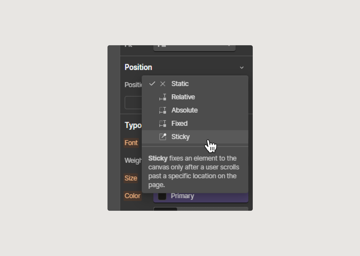
And suddenly, apparently the sticky positioning doesn't work. (😭)
Why? Well, for some reason I'm not aware of, Overflow Hidden is not compatible with sticky positioning, it just doesn't work.
The problem is that until you know this, you might spend a lot of time figuring out why sticky positioning isn't working, and of course, it's not obvious that Overflow Hidden is breaking the sticky positioning.
To solve this, there's the "Overflow Clip" property, which is literally the same as Hidden, but without breaking the sticky positioning. It's essentially the same thing, but compatible.

To add this property in Webflow, we used to do it with custom code, because in Webflow natively we only had "Visible or Hidden", we didn't have "clip".
Today, Webflow announced last week that you can now add certain CSS properties to certain divs. From there, you can add "Overflow Clip" to the page wrapper.
2nd Improvement
This relates to typography. Often in titles or text in general, we want the typography to be visually balanced.
In Figma, it's easy because we drag the boxes until the values fit well. But in Webflow, we can't do this because that class is shared among all titles. That is, one title might look good, but the others won't.

Therefore, the first solution is to add a combo class and then add a specific rule.
This is not ideal; the goal is to generate as few classes as possible and have them closely connected.

That's why we should set a prudent max width and then add the "text-wrap: balance" property. This will automatically balance the texts according to the available space.

It's magical.
You can also do this from the new CSS properties panel.
3rd Improvement
A very common mistake is when we want a box to have a width of 232px, we simply set its width to 232px.
This creates a problem because what you're saying is that it should always be 232px, regardless of the canvas width.
This isn't ideal because when the screen is smaller than 232px, this element won't be responsive. Essentially, we're telling it, "regardless of the screen width, always be 232px."
This will result in horizontal scrolling because this content will exceed the canvas.
To solve this, instead of adding 232px to the width, we should add it to the "max-width". We're telling it to cut off at 232px whenever it's equal to or larger than 232px, but as soon as the canvas width becomes 231px or less, it should start adapting responsively to the canvas.
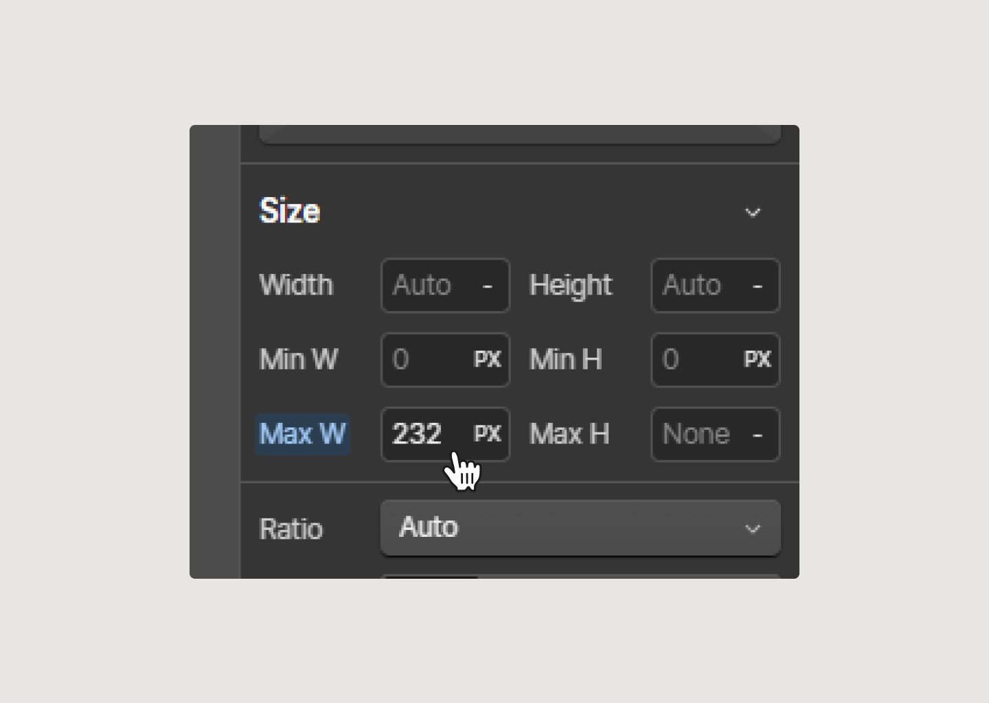
Just as we don't use min-widths much because they're not very responsive except in very specific situations, don't use fixed widths either, because it's practically the same thing.
Always use maximums, and minimums that adapt according to the canvas dimensions.
I hope this saves you many afternoons investigating why things aren't working.
Everything always has an explanation.
I’m thrilled to announce that I can finally announce Koala UI. Koala is the project I have been working on for the past 8 months.
Koala UI is a Design System built for users who are looking to create uniquely beautiful websites with highly converting structures and SEO optimization.
Download now: koalaui.com

If you are interested on making a living with Content Creation, I’m thrilled to announce that I’ve recently release my book: From $0 to $10.000 on client projects with only 10.000 followers on Instagram”.

🔖 The Bunker Bookmarks
🖊️ My portfolio
📕 The Ultimate Guide to Choose the Right Typeface · Workbook
🧠 Second Brain for Creatives · Free Download
📕 Typography is for everbody™ · Free Download
💖 Favorite icon pack.
🎨 Favorite Color Generator.
🪄 More related content...
✱ ·🥂 5 Reasons to Create an Agency this 2023 · The Bunker #21
✱ ·🙊 3 Tips To Teach Your Client to Give Feedback · The Bunker #03
✱ ·🦺 Learn To Follow The Right People · The Bunker #13
✱ ·🚧 When To Build Your Design Portfolio As a Freelancer · The Bunker #09
✱ ·💸 How to Raise Your Prices as a UX Freelancer · The Bunker #23
✱ ·🏫 My Experience in a Design School/University · The Bunker #14
🤹🏻 My Equipment
✱· Most Productive Designer Mouse
✱· Office chair
✱· Sony A7IV