


🔑 How to seriously get better at UX/UI · The Bunker #123
Ever since I made that switch, my perspective on design has changed radically...
The other day I was thinking… The concept of "improving" is quite complex.
What would I tell my 10-years-younger self?
Probably… Stop doing just landing pages and start designing SaaS. Or if you can, focus on SaaS/Product first and then transition to landing pages.
Ever since I made that switch, my perspective on design has changed radically.
I learned that design is not just visual; it’s a tool to facilitate tasks, optimize processes, and, in many cases, help users save time and make money.
Designing a SaaS product is a challenge, but it's where you truly learn how to create digital products that have an impact.
Not because landing pages aren’t valuable, but because when you design SaaS, everything changes. It’s no longer just about making something look good; it’s about helping people complete tasks, save time… and even make money, why not?
In fact, sometimes you’ll design something that isn’t visually stunning, but it will solve a huge problem for a user.
At least, this is what I love about design. Everyone has their own reasons for being in this field, but for me, it was about creating an impact on people.
So my advice is this: if you want to improve in UX, jump into product design rather than keeping yourself around marketing-related design (if that’s your goal in life).
If you want to be a better branding designer, then just keep practicing and doing more branding projects.
Mindset shift
One of the biggest mistakes in UX is focusing too much on "designing screens" without questioning the real user flow. In SaaS, this becomes critical.
For example, instead of saying: "I have to create the item creation modal."
Change your mindset to:
The user needs to be able to create an item.
From tasks → To user journeys.
And automatically, you start thinking about implications:
Where should the user create the item from?
What fields are needed to create the item?
Are there any necessary error states?
How do I visually show success to the user?
Where should they be redirected after completing the task?
If you're designing a product that enables users to create something (a task, a report, a project), you have to ask yourself:
What steps does the user need to complete?
What information do they need before starting?
What common blockers exist, and how can we avoid them?
This gives you way more insight than just treating it as a simple task.
I remember the first time I designed a SaaS product seriously.
I had spent weeks crafting a beautiful interface, but when we tested it with users, everything fell apart. (That always happens).
Users didn’t understand where to start. They got frustrated by things that seemed obvious to me.
That’s when I realized that in SaaS, you’re not designing for something to "look good"—you’re designing so people can do their work without even thinking about it.
Or even enabling them to do things they previously couldn’t.
For example, let me tell you about a project I’ve been working on: a user tablet for people who want to roleplay as police officers in GTA V Roleplay. (I know sounds weird, but whatever. We’ll talk about my interest in UX/UI in games later 😅).

Right now, nothing like this exists. Thanks to an interface I designed from scratch, players can now unlock new possibilities. And this is the superpower I love and always talk about.
Or another example: a tool for business owners in roleplay servers to manage their economy. This wasn’t possible before, but that’s the magic of SaaS. One day, you release a feature, and suddenly, users have superpowers they never had before.

Limited space, big decisions
SaaS design isn’t about filling the screen with options; it’s about making decisions that directly affect the user experience.
A poorly designed dashboard can make someone waste hours a day. A well-designed one can boost productivity and help a company make more money.
In SaaS, every UX decision impacts:
Time: Do you make access to the most important things easy?
Productivity: Can users complete tasks without friction?
Conversion: Do you make users want to keep using the tool?
And this is the pressure and importance of a designer. That's why you learn so much with SaaS, because these are all the things you have to consider when designing.
Every time I see a well-designed SaaS product, I realize the importance of small decisions.
Something as simple as a good "empty state" can make someone understand the product in seconds, or get lost forever.
And these small decisions are what separate a Junior from a Senior. This is where you see real design evolution. It becomes obvious who has more experience.
When you’re designing something now with a level of attention to detail that would have been impossible for you before.
Why designing SaaS is worth it
At first glance, designing SaaS might seem complicated. It’s a challenge to think about systems, workflows, and time optimization. But honestly, it’s one of the best ways to grow as a UX designer. Why?
You learn to design with real impact: It’s not just about looking good; it’s about creating value. Plus, using your own products is always satisfying—it makes design feel tangible.
You develop strategic thinking: You start thinking in terms of efficiency, conversion, and scalability. I also believe this is one of the design fields that really helps you understand business, rather than just prioritizing visuals as we sometimes do.
It opens more doors in the job market: SaaS projects are some of the highest-paying ones, and for a reason. The B2B industry moves billions of dollars, and many companies rely on digital tools to operate efficiently. As a SaaS designer, you have an enormous responsibility: the decisions you make can help a business make more money, reduce costs, or even lose customers if the product isn’t well designed. This means your work isn’t just valued—it’s essential. When you create a clear and efficient interface, you’re not just improving the user experience; you’re directly impacting a company’s profitability.
Charging for a branding project can be tricky because justifying its direct impact on a company’s revenue isn’t always obvious. But in SaaS, it’s different. When the core business depends on the interface you design, your work stops being just a visual layer and becomes a revenue driver—or a loss generator. Every decision you make can determine whether a company earns more or less, whether its users are more productive or abandon the product. In this context, design isn’t just about aesthetics—it’s a key part of the business model.You understand how a business works: You start seeing design as a tool to increase revenue, cut costs, and improve customer retention.
Yes, it’s a challenge. But it’s the kind of challenge that, if you overcome it, turns you into a much more well-rounded product designer.
Frankly, this is where I’ve seen the biggest evolution in my design skills and my mastery of Figma.
Moving from landing pages to SaaS forced me to develop a much more structured mindset, think in reusable components, create efficient user flows, and understand how every design decision impacts the business. This is where you truly learn to optimize processes, simplify interactions, and design products that work intuitively.
If you want to seriously improve start building your own SaaS
Just like I did with Branding Website or the GTA V tablet. Just fun simple projects.
If you want to start building your own SaaS, I recommend planning carefully. Define a clear vision, prioritize the user experience, and structure your project efficiently from the beginning.
Good planning is key to avoiding roadblocks and making better decisions along the way. And if you need help organizing and managing your business as a designer or entrepreneur, check out my Freelancing Notion Bundle—a collection of tools designed to optimize your workflow, manage projects, and boost productivity.

If you only design landing pages or aesthetic interfaces, you’re missing out on the strategic side of UX. Designing SaaS forces you to think about systems, workflows, and user decision-making.
And once you master UX, your UI will be stronger than ever.
Until next time,
Jordi Espinosa.
✨ This Week’s Sponsor
Koala UI is a Design System built for users who are looking to create uniquely beautiful websites with highly converting structures and SEO optimization.
Get 20% off with code: THEBUNKER20.

If you've ever wondered whether you can make a living through content creation, I’ve got something exciting to share!
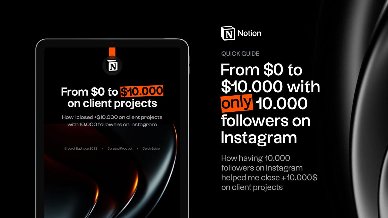
I just released my book: From $0 to $10,000 in client projects with only 10,000 followers on Instagram—a journey of how I turned my passion into a profitable business.
🔖 The Bunker Bookmarks
⚡ [FREE] Favourite site for branding inspiration
🖊️ Freelance Notion Bundle · 16 Templates in 1 Pack
🖊️ My portfolio
🖊️ [FREE] Favorite Figma UI Kit
📕 The Ultimate Guide to Choose the Right Typeface · Workbook
🧠 [FREE] Second Brain for Creatives · Notion Template
🧠 [FREE] How to Make a Living from Social Media with Only 10.000 Followers
📕 [FREE] Typography is for everbody™
💖 [FREE] Favorite icon pack.
🤹🏻 My Equipment
✱· Most Productive Designer Mouse
✱· Office chair
✱· Sony A7IV